If you carefully observe contemporary interior spaces, you'll find that WPC wall panels are no longer simply positioned as a "cheap alternative." They're more like a product of balance between efficiency and quality—retaining the visual warmth of wood while possessing the structural stability of polymer materials. They solve not only the problem of durability, but also the relationship between construction schedule, maintenance costs, and long-term use.
But what truly determines the ambiance of a space is not the panels themselves, but the choice of color. Color is the quietest yet most powerful language of a space. It determines how light is reflected, how layers are organized, and whether the style is restrained, warm, or flamboyant.
Choosing the color of WPC wall panels is essentially about establishing a sustainable visual order for the entire space. So, what colors are typically available for WPC wall panels, and how should you choose the right color for you?
You should know that half of a space's style is determined the moment you choose the colors. Light wood tones tend to slow down a space, leaning towards naturalness and restraint; dark walnut has a greater sense of weight, suitable for emphasizing texture and layering; while marble patterns inherently possess a sense of calm and order, closer to modern and minimalist expressions.
Color is not an add-on to decoration, but rather the underlying language of a space. The diversity of WPC wall panel colors doesn't truly offer "more styles," but rather the possibility of a more controllable and clearer direction for the style.
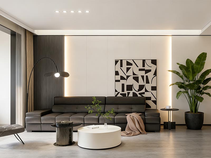
In a space, the walls are always the largest visual element. They are not just a backdrop, but the foundation. If the wall colors are unbalanced, even the most luxurious flooring and exquisite furniture will struggle to create a true sense of unity. Colors need to be logically connected, not coincidentally matched—the shades of the flooring, the materials of the cabinets, and the saturation of the soft furnishings must all be on the same visual axis.
WPC wall panels' rich and clear color swatch system makes this matching process less reliant on "feeling" and more predictable, controllable, and stable in the long term.
Color is one of the most subtle architectural tools in a space.
Light tones don’t just look brighter—they actively push walls outward, reflecting light and expanding visual boundaries. Dark tones do the opposite: they absorb light, add weight, and anchor the room with a sense of depth and stability.
When used intentionally, color can recalibrate proportions without moving a single wall. It’s not decoration—it’s spatial control through perception.
Truly valuable spaces are never built on trendy colors, but on a foundation of stable color logic. Neutral colors are repeatedly chosen because they are restrained, timeless, and not easily outdated. They leave room for furniture and soft furnishings, and allow for future adjustments.
Good color decisions not only improve the current living experience but also lay the foundation for the long-term market performance of the property. Choosing the right colors makes the value of the space more sustainable.

When it comes to color selection for WPC wall panels, the market has long since developed a clear and mature system. From natural wood grain to modern stone textures and even high-end custom color schemes, it covers almost all mainstream interior design styles.
Taking CREATEKING as an example, its WPC wall panel color swatches are clearly categorized, and the series is complete, meeting both standard residential projects and more personalized engineering needs. Colors are no longer limited, but rather systematically managed and expanded.
The wood grain series is almost an "old friend" in WPC wall panels. Light oak and natural wood colors are light and natural, allowing the space to breathe; walnut and teak bring a touch of calm, while dark brown instantly adds thickness and texture to the room. Every texture tells a story, giving the walls both warmth and attitude.

The marble series is a visual weapon tailor-made for modern and understated luxury spaces. Carrara White exudes purity and brightness, while gray veining is understated yet textured. Contrasting black and white textures instantly enliven a space, and gold veining adds a touch of luxury.
Each piece's texture tells a story on the wall, enhancing the sense of space and visual tension, making your walls not just a backdrop, but an extension of the space's soul.

The fabric collection is like draping a soft veil over a space, with gray, beige, and low-saturation tones subtly creating a comfortable rhythm. In the bedroom, relaxation area, or any corner where you want to slow down, it allows the walls to speak subtly, making the space feel like it's breathing, with warmth and texture flowing naturally rather than being deliberately displayed.

The leather-textured series exudes understated luxury on the walls. It doesn't rely on garish colors, but rather on its tactile texture to subtly convey its presence within the space.
Used as a partial decoration on a living room background wall or a special wall, a simple application can add depth and a sense of stability, giving the space a sense of breath and weight without being overly ostentatious—like a designer's subtle touch in a corner.

The diatomaceous earth wall covering series is like bringing nature into the walls; every texture tells a story of wind, earth, and light. The soft earth tones are understated yet warm, unassuming yet allowing the space to breathe, bringing a tangible texture and tranquility.
After careful observation and keen observation, you'll realize it's not just a simple decoration, but an environmentally friendly and warm design approach, allowing the walls to tell a silent story, soothing the space, and calming the soul.

The Skin-Touch series is like a subtle tactile performance; its matte finish is delicate and smooth to the touch, allowing you to feel the warmth and texture of the walls with every approach. Pure colors like sophisticated gray, off-white, and warm white, without exaggerated embellishments, allow modern minimalist spaces to breathe.
It's not an eye-catching element, but rather it quietly defines the style of the space, making the walls a silent accompaniment, supporting the rhythm and atmosphere of the entire room.

Customizing colors is like giving a space a personalized label. CREATEKING updates its color swatches annually, allowing you to quickly identify trending colors, but the real magic lies in its team of experts, who will blend a color scheme exclusively for you based on the atmosphere, lighting, and material requirements of each project.
The current color trend of WPC wall panels is actually a kind of understated wisdom. Designers no longer pursue dazzling and highly saturated colors, but return to the logic of "soft, pleasing to the eye, and unassuming": light wood tones, warm gray, and off-white quietly define the rhythm of the space, allowing the room to breathe and tell its own story, rather than relying on eye-catching colors.
A return to nature is a gentle revolution in wall color. Light wood tones and natural textures quietly spread throughout the space, making each wall feel like a breath brought back from the forest. It's not noisy, but it allows light, furniture, and soft furnishings to blend naturally in a low-key warmth, making the space vibrant yet uncluttered.
The sophisticated gray tones are the silent language of modern spaces. Low-saturation grays and beige-grays are like a stage reserved for light and shadow, allowing furniture, flooring, and decorations to breathe freely under the gentle embrace of the walls. It's understated, yet subtly establishes a sense of order and sophistication in the space, making each wall seem to whisper a story.
Contrast is a subtle, artful technique in spatial design. The combination of light and dark colors, along with accented accents, seems to write rhythms on the walls, instantly making the spatial layers clearly perceptible. It's not noisy, yet it allows the eye to breathe; with the flow of light and shadow, the walls seem to tell a story, both bold and composed.

Choosing a color isn't just about randomly painting over a favorite hue; it's about setting the tone for a space. It requires considering lighting, function, and furniture, like weaving an invisible thread of order into the room, allowing every wall to breathe.
The walls in each room seem to tell a different story.
Neutral or light wood tones in the living room create a light and airy feel, offering a sense of openness; low-saturation warm colors in the bedroom create a quiet and gentle atmosphere, promoting relaxation; light colors or marble patterns in the kitchen and bathroom create a clean and bright ambiance; light colors in the hallway and staircase elongate the space, allowing light and shadow to flow freely, and giving each wall its own breath.
Light is the gentlest judge of wall colors. When there is plenty of natural light, cool or dark colors can create depth; when there is insufficient light, use light colors to reflect light and brighten the space; avoid layering warm colors in warm-light environments, while wood grain adds warmth under cool light, allowing each wall to whisper with the light.
Contrast creates a subtle drama in a space. The combination of light and dark colors, and the use of accent colors in certain areas, creates a rhythmic pattern on the wall, allowing the eye to breathe and creating distinct layers.
To ensure your WPC wall panels retain their color for longer, proper maintenance is essential:
1. Color Selection Tips: Dark colors tend to show dust easily, pure white easily highlights stains, and wood grain finishes are more resistant to dirt.
2. Use the correct cleaning method: It is recommended to use a neutral detergent and a soft cloth to wipe, and avoid strong acid and alkaline detergents.
3. UV Protection: CREATEKING's WPC wall panels typically contain UV protectants to enhance performance. However, direct application in environments with prolonged sunlight exposure is still not recommended (if unavoidable, use curtains or a blackout design).
The colors of WPC wall panels are not arbitrary decorations, but rather an invisible language of the space. Whether it's wood grain, solid color, or stone, each wall tells a story. When color, light, and structure reach a harmonious understanding, the space breathes, the atmosphere naturally takes shape, and value quietly settles in.
Q1:What colors are available for WPC wall panels?
A1: CREATEKING's WPC wall panels are available in a variety of colors.
These include natural wood grain (oak, walnut), marble textures, solid neutral colors (white, gray), fabric tones, leather textures, diatomaceous earth tones, and custom colors.
Q2: Are wood-grain WPC wall panels the most popular option?
A2: Yes. Wood grain finishes like light oak, original wood, walnut, and teak remain the most popular because they combine natural warmth with versatile design appeal.
Q3: Can WPC wall panels mimic stone or marble patterns?
A3: Absolutely. Many manufacturers offer marble‑patterned WPC panels – such as Carrara white or grey veined styles – to create a modern, elegant look without the weight or cost of real stone.
Q4: Do WPC wall panels come in solid color options?
A4: Yes. WPC panels are available in solid colors such as white, beige, grey, and black, often in matte or satin finishes that suit minimalist and contemporary interiors.
Q5: How do I choose the right color for my WPC wall panels?
A5: Consider room function, lighting conditions, furniture, and flooring.
Light tones expand space visually, while darker tones add depth and contrast. Coordinating with other interior elements ensures a cohesive aesthetic.
Q6: Are neutral tones more timeless?
A6: Yes. Neutral tones like greige, warm grey, and off‑white are considered timeless because they adapt well to evolving styles and maintain resale appeal.
Q7: Do darker colors make a small room look smaller?
A7: In low‑light or compact spaces, deep, dark hues can visually shrink a room. Lighter colors tend to reflect light and make spaces feel larger and more open.
Q8: Can WPC wall panel colors fade over time?
A8: High‑quality WPC panels often have UV‑resistant surfaces to reduce fading. Proper placement out of direct sunlight and regular maintenance also help retain color vibrancy.
Q9: How do WPC wall panel colors impact interior style?
A9: Color sets the emotional tone of a space.
Warm wood grains create a cozy feel, cool greys feel modern and calm, and accent colors can introduce drama or emphasis without overwhelming the design.