When choosing WPC wall panels, people often prioritize performance indicators such as waterproofing, durability, and ease of maintenance. However, in a real space, color is the core language that determines everything. It shapes the atmosphere of a space, elongates or shrinks the visual scale, and subtly influences people's emotions and experiences.
There is no "one right color" for WPC wall panels. The so-called best choice is a rational decision based on a careful consideration of factors such as lighting conditions, design style, functionality, and long-term value.
Color is never merely an embellishment, but a spatial structure. Light colors extend the sense of scale, making the environment appear transparent and open; dark colors are calm and restrained, injecting strength and depth into the space. Warm colors soften architectural lines, while cool colors strengthen contours and order.
WPC wall panels often occupy a large visual focal point, and their color choices directly determine the atmosphere, depth, and personality of the space. Truly excellent color matching is not just about matching furniture, but about allowing materials, light, and function to resonate with each other, forming a highly unified overall expression.
There are no absolute answers when choosing colors for WPC wall panels; there are only the most suitable options for the space.
Light colors can expand the visual field, enhance natural light, and make small spaces feel more open and bright; dark colors can strengthen contrast and layering, giving a space a sophisticated feel, making them ideal for feature walls and high-ceilinged areas. Warm colors create a cozy and comfortable atmosphere, while cool colors convey restraint, modernity, and order. The truly "best" color always serves the function and emotional expression of the space.
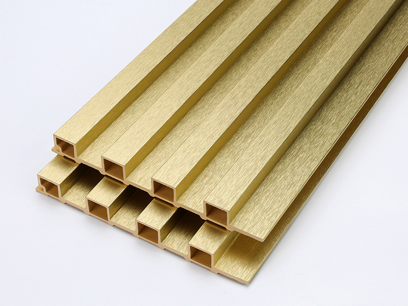
Modern WPC wall panels are no longer limited to basic wood grain tones. Today's finishes are mainly divided into three categories:
Wood grain WPC wall panels are the most classic and popular series. From fresh maple and natural oak to sophisticated walnut, teak, and dark coffee tones, these textures realistically reproduce the layers and textures of natural wood, meeting the needs of different design themes and providing a stable and timeless option for projects.
Wood veneer excels at infusing space with warmth and texture, making architecture more inviting and rhythmic. It's suitable for creating cozy homes and is also widely used in hotels, commercial spaces, and feature wall designs.
Compared to natural wood, WPC wood veneer is more stable, durable, and easier to maintain, while retaining its natural beauty, making it an ideal solution that balances design and practicality.

In the WPC wall panel system, solid colors and neutral colors form the most stable color foundation for modern design. White, ivory, and beige bring brightness and a sense of order; light gray, cement gray, and warm gray balance rationality and warmth; charcoal gray and matte black emphasize depth and architectural feel. These color schemes downplay decorative attributes and highlight the proportions, structure, and material relationships of the space itself.
Solid and neutral-colored WPC wall panels are particularly suitable for minimalist, modern, industrial, and high-end commercial spaces. They blend seamlessly with materials such as glass, metal, and stone, creating a clean and unified visual system.
Furthermore, these colors are timeless and adaptable to various interior design changes, helping projects maintain a sophisticated feel while ensuring long-term usability.
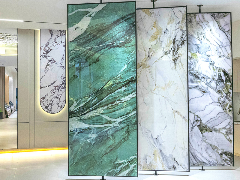
Marble-textured WPC wall panels incorporate the texture and vibrancy of natural stone into the WPC system, creating a striking visual effect. Common color schemes include classic Carrara White, Jazz White, light grey cloud pattern, dark grey stone pattern, black and gold pattern, and warm beige marble pattern. These color schemes retain the texture of stone while being more stable and lightweight, making them more suitable for large-area wall applications.
Marble-textured WPC wall panels are suitable for high-end commercial spaces, brand showrooms, and feature wall designs with a modern, minimalist luxury style. They can quickly create a visual focal point, enhance the quality and recognizability of a space, while avoiding the bulkiness, complex construction, and high maintenance costs of natural stone. This makes projects more practical and easier to control while achieving a luxurious visual effect.
Application scenarios | Recommended colors | Reasons for the choice |
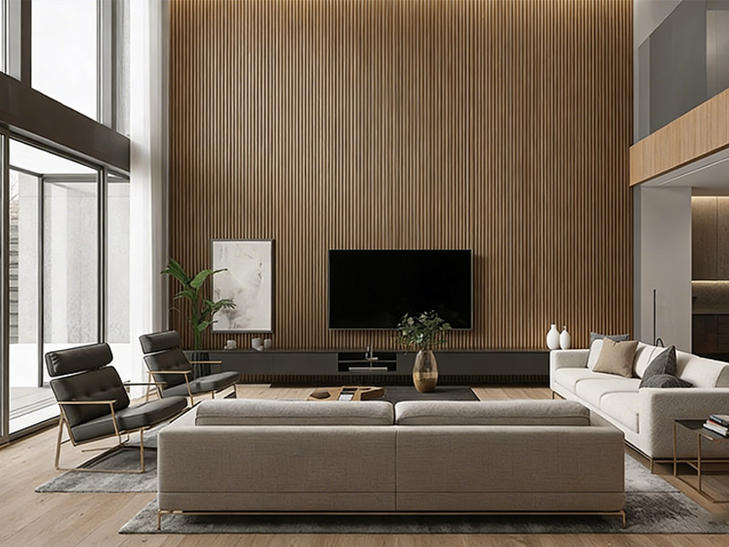
Living room TV background wall | Natural wood color, light gray, dark gray, and some darker areas | Establish a visual focal point and enhance the sense of spatial hierarchy. |
Featured Wall | Dark wood color, charcoal gray, marble pattern, contrasting colors | Enhance design tension and create memorable spatial elements. |
Bedroom | Light wood color, beige, warm gray | Reduce visual distractions and create a quiet, relaxing, and comfortable resting atmosphere. |
Indoor corridor | Medium wood color, medium gray, grayish brown | The gray tone is dirt-resistant, making stains less noticeable. |
Ceiling / Suspended Ceiling | White, light gray, and light wood tones, with some darker areas. | Light colors enhance the height and brightness of a space, while dark colors strengthen the structural layers and design sense. |
Entryway | Medium-dark wood tones, warm gray tones, and stone-like colors | Enhance the first visual impression while balancing aesthetics and durability. |
Commercial space | Brand's main color, dark gray, stone pattern, marble pattern | Strengthen brand image and create a professional atmosphere. |
Light is the primary factor determining the effect of color presentation. Spaces with ample natural light can accommodate deeper or cooler tones, while areas with limited natural light are better suited to lighter or warmer colors to avoid a feeling of confinement. Artificial lighting also alters color temperature and brightness; different color temperatures will amplify or diminish the original color tone of the wall panels.
Therefore, when choosing wall panel colors, it is essential to conduct tests based on the actual lighting environment, rather than relying solely on samples.
WPC wall panels never exist in isolation; they always form a cohesive whole with flooring, furniture, doors, windows, metalwork, and soft furnishings.
Wood-toned wall panels emphasize warmth and a natural feel, making them suitable for pairing with fabrics and stone; gray tones blend more easily with glass, metal, and concrete, creating a sense of modern order. The essence of color selection is the balance of material relationships, ensuring that the space is unified in layers without being monotonous.
Color not only affects the immediate appearance but also determines the long-term look. Colors that are too dark or too light are more prone to showing dust and wear, while neutral colors and natural wood tones are more durable and age-resistant. For high-frequency use areas, prioritize colors that are stain-resistant, stable, and less likely to cause fatigue.
At the same time, pay attention to the product's UV resistance and colorfastness to ensure the wall panels maintain their original design over time.
While WPC wall panels offer many popular and well-received color options, this doesn't necessarily mean they're right for you.
The best wall panel color for you should harmonize with your architectural style, respond to changes in light, complement various materials, be durable, and consistently maintain visual comfort.
When color selection is based on performance, design logic, and practical application, rather than short-term trends, WPC wall panels transcend mere wall decoration materials and become part of the spatial identity.